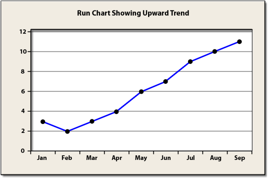
A Run Chart is a basic graph that displays data values in a time sequence (the order in which the data were generated). A Run Chart can be useful for identifying shifts and trends.
Example: A supervisor of a customer service center collects data on the number of complaints that are filed each month. Data for the last several months are shown below.
A Run Chart for this data is given below.
Note that the Run Chart shows a distinctive trend upward in the data. Clearly, a Run Chart would also be useful in identifying downward trends in the data as well. While different practitioners use different rules, the basic rule of thumb is when a Run Chart exhibits seven or eight points successively up or down, then a trend is clearly present in the data. This is like flipping a coin and seven times in a row it comes up heads or tails. Could it happen randomly? Yes, but not likely.


