
A Six Sigma control chart is a simple yet powerful tool for evaluating the stability of a process or operation over time. Creating a control chart requires a graph that covers a period of time, a center line that shows the results of a process during that time, and upper and lower control limits that indicate whether process variation is within an accepted range.
A control chart offers a way of taking the details involved in creating and improving a process and having one chart that shows the outcome. That’s vital information because processes fall under four states: ideal, threshold of ideal, on the brink of chaos and in a state of chaos.
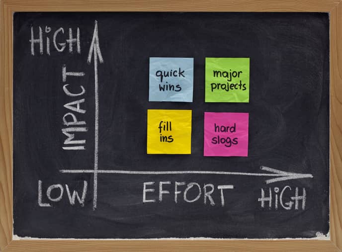
Too many organizations wait until the last one before making changes.
Why Six Sigma Control Charts Are Important
The importance of a control chart can be summed up in one idea: All systems tend to gravitate toward a state of chaos.
Left without the helping hand of continuous process improvement and analysis, any process or operation – from the factory floor to the reception desk at a hospital to your home office – will slip eventually into chaos. It’s just a matter of time.
Much like a value process map plots out every step of a process and determines where errors and consistencies lurk, a control chart offers a way to determine whether the overall process is resulting in the best outcome possible.
It does so by measuring variation. All variations fall into two overall groups.
Common-cause variation – This type of variation is inherent in a process. Common-cause variation is anticipated but typically falls within control limits. This type of variation is random – no actions by one person or combination of factors led to the variation, and therefore it’s impossible to eliminate completely.
Special-cause variation – This type of variation is non-random and happens through the actions of a person or some combination of factors within an operation. These are the errors or poorly conceived process designs that can be fixed or eliminated.
Knowing the type of variation in a process is valuable information. A control chart detects which type of variation is happening. It allows you to understand when and when not to act, as well as understand whether a process is in control or trending toward the brink of chaos.
Designing the Control Chart
Establishing the centerline for the control chart requires you to first determine what data you need to chart.
A simple example: You want to get to work on time every day. The centerline would show what time you arrived at work every day over a set period. For companies, the centerline might show the number of sales made in a fiscal quarter. A hospital might record the time it takes to admit a patient.
Then, you must establish control limits that indicate an acceptable range of variation. In other words, what is the expected common-cause, random variation that is inherent in the process? This is established by incorporating data over an extended period of time.
Using the simple example of when you get to work, you might establish a time that is 10 minutes late and 10 minutes early, a time range that considers the random common-cause variations inherent in a commute. That is, car accidents, severe weather slowing drivers, a traffic jam at particular locations, etc.
Is It Really A Problem?
Establishing these control limits lets you know if the process needs changing. This saves a company time spent addressing issues that don’t need addressing.
Again, using the commute example – if you are 15 minutes late one day in three weeks but otherwise fall within the time range specified on the control chart, you are in good shape. But if you are 15 minutes or more late consistently, it’s time to look at the process. In this case, what time you leave home and what might cause you to leave later than you should. Or perhaps you need to find a new route.
For businesses, consistent variation outside of the control limits means a process is not meeting customer expectations and is sliding into chaos.
More Detail on Control Charts
The above offers an overview of how a control chart can work. For more complex business operations, making control charts can involve charting subgroup processes that are part of a final product.
For example, construction of cars, trucks and planes involves thousands of parts and tasks. Constructing a chart to map out subgroups such as construction of individual parts might be required.
When constructing a control chart, it’s important to keep the following in mind:
- Gather and record data in the order of production
- Collect data sets over a period of time that help you establish the upper and lower control ranges using averages
- Plot and connect dots that indicate, from left to right, the data over a period of time
- Act on what the chart tells you
That final part ranks among the most important. Shifts and trends do not happen randomly. A shift is a sudden change that is seven (7) points beyond the control limits. A trend is indicated when seven points in a row move in an upward or downward direction.
Control charts also may be used as an analysis tool. It’s possible to apply Six Sigma tools such as a Pareto Chart or Histogram to better analyze data produced with a control chart.
