
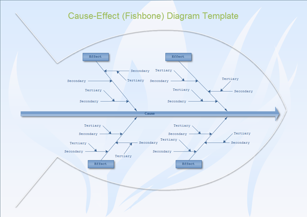
A Cause and Effect Diagram is a graphical tool for displaying a list of causes associated with a specific effect. It is also known as a fishbone diagram or an Ishikawa diagram (created by Dr. Kaoru Ishikawa, an influential quality management innovator). The graph organizes a list of potential causes into categories.

The Cause and Effect Diagram shown here happens to have six branches. There is nothing magic about the number of branches. This one happens to be six because sometimes it’s convenient to have the chart coincide with the Six M’s. [i.e., Man (in the Generic Sense), Machine, Material, Method, Measurement, and Mother Nature] The team often chooses to use homogeneous groupings for the branches; however, many groupings there are, that’s how many branches will be on the chart. (below)

Example: A company has experienced problems with a particular machine. The drilling operation is producing an excessively large size of burr. What’s a burr? If you were to drill a hole in metal; then, if you were to run your finger across the hole and it cuts your finger, the cut was caused by a burr. It’s virtually impossible to drill a hole without a burr, but it isn’t impossible to minimize the size of them. The team chose to use a Cause and Effect Diagram to list as many causes as possible that might have an effect – which in this case is the burr. (See below)

The following illustration is a close-up look at a PORTION of the Cause and Effect Diagram. As you can see, the branches are subdivided into smaller branches and twigs. If the original Cause and Effect Diagram had more detail, these charts probably would have been called tree diagrams. More detail is always better. And, that’s why we brainstorm.
 Keep in mind that the items listed on the Cause and Effect Diagram are potential causes. The Cause-Effect Diagrams should be used not only to document the list of causes, but also to direct data collection and analysis.
In practice, the team would want to exhaust each of the items listed as potential causes through the use of the ‘five whys’ technique.
WHY are the instructions inadequate? Because there are no illustrations.
WHY are there no illustrations? There is no reason why we cannot provide illustrations.
WHY not provide illustrations then? We will – starting next month. …and so on. The WHY QUESTIONS should be reflected on the chart as smaller branches and twigs.

