
Seven Attributes of a Lean Six Sigma Control Plan
How can an organized Lean Six Sigma control plan help improve your business? One of the main objectives of Lean Six Sigma is cutting out unnecessary steps and waste in …

How can an organized Lean Six Sigma control plan help improve your business? One of the main objectives of Lean Six Sigma is cutting out unnecessary steps and waste in …
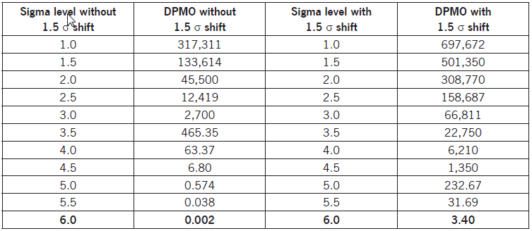
The following table will convert Defects Per Million Opportunities to a Sigma Level.
Brainstorming is a method for generating a large number of creative ideas in a short period of time. Brainstorming is full of energy, moves rapidly, and is synergistic, creating a large list of ideas which may eventually be boiled down, or funneled down, to a smaller list of priority items later in the project.
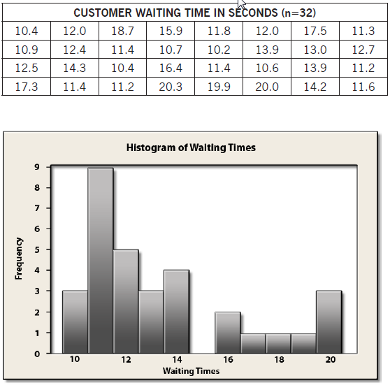
Histograms are used to show the distribution of a set of collected data.
Generic bar charts can be created for any type of categorical or numerical data. If the categories of the data plotted in a bar chart have no meaningful order, many different charts can be created by rearranging the order of the bars. Histograms, on the other hand, are used to show the pattern or the distribution of the data across the categories, so there must be only one correct pattern.
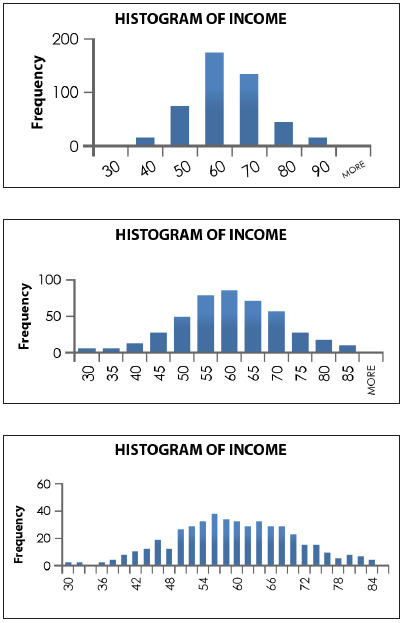
The choice of Cell Intervals (the number and width of the classes used to construct a histogram) can have an effect on the shape of the histogram. In general, a smaller number of intervals results in a less distinct shape, while a larger number of intervals can reveal unexpected patterns.
Note: Please refer to the other topic on cell intervals for more information about rules-of-thumb in regard to cell choices.
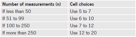
When constructing a histogram (a graph in which the classes are identified on the horizontal axis and the class frequencies are shown on the vertical axis by the heights of the vertical bars) it is important to choose an appropriate number of Cell Intervals (the grouping you will use to generate the classes for the histogram).
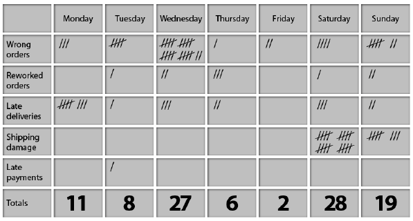
The Check Sheet is a simple document that is used for collecting data in real time and at the location where the data is generated. The document is typically a blank form that is designed for the quick, easy, and efficient recording of the desired information, which can be either quantitative or qualitative. When the information is quantitative, the check sheet is sometimes called a tally sheet. The check sheet is one of the seven basic tools of quality control made popular by Dr. Kaoru Ishikawa.
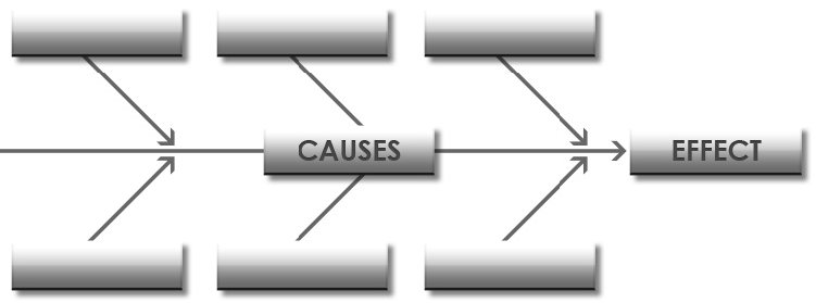
A Cause and Effect Diagram is a graphical tool for displaying a list of causes associated with a specific effect. It is also known as a fishbone diagram or an Ishikawa diagram (created by Dr. Kaoru Ishikawa, an influential quality management innovator). The graph organizes a list of potential causes into categories.
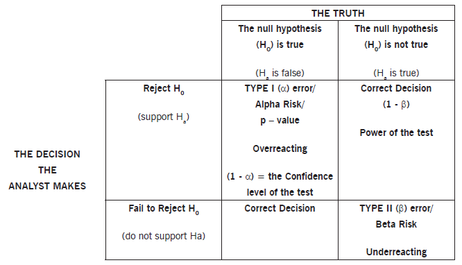
There are four possible outcomes when making hypothesis test decisions from sample data. Two of these outcomes are correct in that the sample accurately represents the population and leads to a correct conclusion, and two are incorrect, as shown in the following figure:
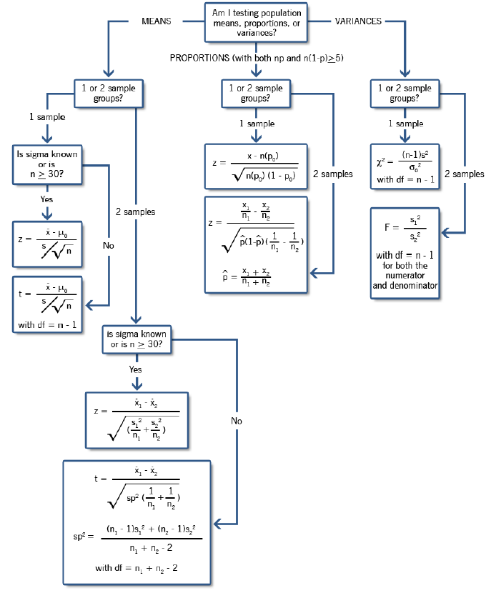
Below is a decision tree for the most commonly used hypothesis tests: